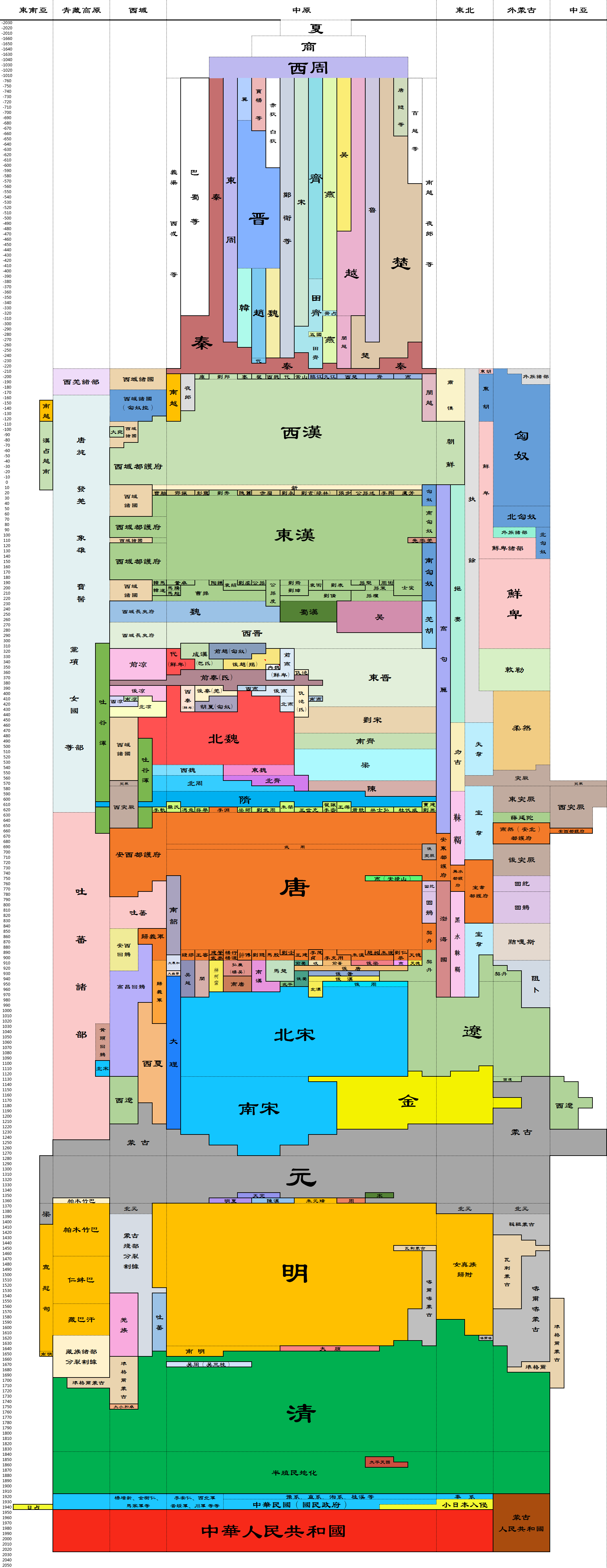
Imagine compressing China's historical territory from a 2D plane into a 1D line, then adding a time axis. What kind of chart would you get?
A user named "Da Wenxi" on Baidu Tieba's History Forum created this Excel-based Chinese dynasties span chart.
In this chart, the horizontal axis represents the territorial size of each dynasty, while the vertical axis shows its duration. It's highly intuitive and an excellent tool for learning history.

Comments